Creation - Some nice bits in the start with the differences between dark and light and God lifting up the sky. Having God float over the creation scenes is a nice decision, presumably achieved via Photoshop layering. Genesis 1:10, the creation of land, is a great example of this. I'm really curious as to what piece is used for the sun here, some lid? And the moon and stars are great (and nice to bracket the story, as he uses a very similar technique in Revelations). Genesis 1:21 with the fish and birds is well done and along with Genesis 1:24-25, the creation of animals, shows how many more LEGO animals are available than when the Brick Testament began. Hey, there's the Kaadu! Now I'm happy again. Great new sheep design in 1:25. About the only non-LEGO aspect worth noting is 1:27, where God makes people, and Brendan chooses not to just make Adam and Eve, but a whole bunch of people. He comments on Flickr that he treated the Genesis 1 and 2 creation accounts separately, without trying to harmonize them. I do think it might have been better here to include racial diversity, with various flesh tone figs included, but perhaps there weren't blank torsos/hips/legs available in these other colors. The final scene, with God kicking back in a hammock on the seventh day, is priceless.

The Garden of Eden - This is generally well done and in keeping with the original version. I really like God building Adam up out of brown dirt, and then bringing him to life as a yellow fig. I'm really not a fan of the design of the Tree of the Knowledge of Good and Evil. I've tried using that stump element as the base for a tree before and come up short, and I'm afraid to say that Brendan's solution doesn't work for me here either. The Tree of Life, OTOH, has a very nice design. In 2:24, it's a little creepy to have God standing there while Adam and Eve get to know each other. In 3:7, I really like the way he's switched heads for Adam and Eve to the open-mouthed expressions, and then keeps these up for the next several scenes. Nice use of the brand new caveman torso for the newly clothed figs, and that last scene is great - especially the scraggly brown out-of-focus trees in the background.

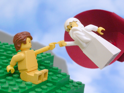
By the way, Brendan also recreated Michelangelo's Creation of Adam, though it doesn't get used in either of these stories.

Hi, Bruce. "Why do this?" is certainly a legitimate question. I have a number of reasons, but my biggest motivator is this: when people come to The Brick Testament website for the first time, and are going to click through a few pages to see if its worth their while, I really, really. Now, if someone were to start at Revelation, that'd be fine. But a much more likely starting point for most first time visitors is the first story in Genesis, and over the last few years now it's bothered me that the first part of The Brick Testament most people see is from my weakest point as a builder, photographer, photo post-processor, and overall storyteller.
ReplyDeleteSince launching the new version of The Garden of Eden, feedback has generally been quite positive, though it has surprised me to hear how attached to certain of the original photos some longtime fans are. Interestingly, there does not seem to be agreement on exactly which ones were so "iconic". It would be interesting to hear from someone who is viewing the new version first and then only later compares it to the originals.
The sun in the Creation story is the same wheel piece I used multiples of to make the pillars on the Temple of Solomon (http://www.thebricktestament.com/king_solomon/god_has_egypt_plunder_jerusalem/2ch12_09a.html) but as the sun you see only the top of the wheel with a 1x1 round plate stuck in the center to fill the axle hole. I used a little photo trickery to make the sun piece seem larger than it truly is compared to a minifig by simply having it a couple inches closer to the camera than God is, but keeping the crispness of the focus on both the same.
Thanks for keeping up the detailed comments after all these years. Not sure yet how much re-doing of the site's oldest material I'll do before the pull to illustrate new Bible material becomes too irresistible. We will see.
Hey Brendan,
ReplyDeleteI certainly understand about having the first thing people see be your earliest and therefore least polished work. If someone clicks on the first chapter of my long-defunct Tolkien project, they'll see one of the first MOCs I built after leaving my dark ages, which is embarrassingly bad. If I ever return to that project I'm very tempted to go back and redo that chapter.