| Please visit the other 'Bricks' blogs: |
|
Monday, June 28, 2010
When in Rome
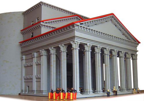
Peggyjdb presents a great rendition of the Pantheon in Rome (this is actually a work-in-progress, as she intends to come back to the project and add the full dome). Built around 126 AD (after two earlier incarnations were each destroyed), this massive temple was devoted to all of the Gods of ancient Rome - i.e. Jupiter and company. The building was recommissioned as a Catholic church in 609 AD, which prevented it from falling into disrepair, though the interior has gone through many changes over the centuries. The structure also houses the tomb of Raphael and other prominent figures.


Tuesday, June 15, 2010
In the beginning . . .
Well, actually just back in 2001, Brendan Powell Smith started his Brick Testament project off with The Garden of Eden and five other illustrated stories from Genesis. He's gone back and redone this, breaking it into two parts: Creation and the Garden of Eden. Part of me asks why do this? Yes, there are many new elements that he uses here that were unavailable nine years ago, and Brendan's building has certainly improved over time, but those original scenes in Eden are so iconic to the Brick Testament that it seems they shouldn't have been touched (e.g. the scene with the Kaadu and Jar-Jar among the created animals). You can compare the old and the new on this page. And the original will always be with us in book form, so let's go on and look at these new iterations with fresh eyes.
Creation - Some nice bits in the start with the differences between dark and light and God lifting up the sky. Having God float over the creation scenes is a nice decision, presumably achieved via Photoshop layering. Genesis 1:10, the creation of land, is a great example of this. I'm really curious as to what piece is used for the sun here, some lid? And the moon and stars are great (and nice to bracket the story, as he uses a very similar technique in Revelations). Genesis 1:21 with the fish and birds is well done and along with Genesis 1:24-25, the creation of animals, shows how many more LEGO animals are available than when the Brick Testament began. Hey, there's the Kaadu! Now I'm happy again. Great new sheep design in 1:25. About the only non-LEGO aspect worth noting is 1:27, where God makes people, and Brendan chooses not to just make Adam and Eve, but a whole bunch of people. He comments on Flickr that he treated the Genesis 1 and 2 creation accounts separately, without trying to harmonize them. I do think it might have been better here to include racial diversity, with various flesh tone figs included, but perhaps there weren't blank torsos/hips/legs available in these other colors. The final scene, with God kicking back in a hammock on the seventh day, is priceless.

The Garden of Eden - This is generally well done and in keeping with the original version. I really like God building Adam up out of brown dirt, and then bringing him to life as a yellow fig. I'm really not a fan of the design of the Tree of the Knowledge of Good and Evil. I've tried using that stump element as the base for a tree before and come up short, and I'm afraid to say that Brendan's solution doesn't work for me here either. The Tree of Life, OTOH, has a very nice design. In 2:24, it's a little creepy to have God standing there while Adam and Eve get to know each other. In 3:7, I really like the way he's switched heads for Adam and Eve to the open-mouthed expressions, and then keeps these up for the next several scenes. Nice use of the brand new caveman torso for the newly clothed figs, and that last scene is great - especially the scraggly brown out-of-focus trees in the background.

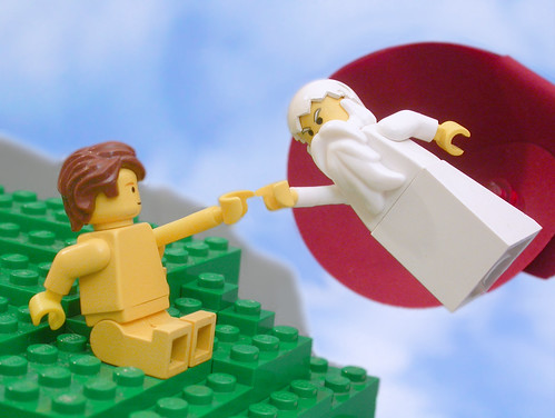
By the way, Brendan also recreated Michelangelo's Creation of Adam, though it doesn't get used in either of these stories.
Creation - Some nice bits in the start with the differences between dark and light and God lifting up the sky. Having God float over the creation scenes is a nice decision, presumably achieved via Photoshop layering. Genesis 1:10, the creation of land, is a great example of this. I'm really curious as to what piece is used for the sun here, some lid? And the moon and stars are great (and nice to bracket the story, as he uses a very similar technique in Revelations). Genesis 1:21 with the fish and birds is well done and along with Genesis 1:24-25, the creation of animals, shows how many more LEGO animals are available than when the Brick Testament began. Hey, there's the Kaadu! Now I'm happy again. Great new sheep design in 1:25. About the only non-LEGO aspect worth noting is 1:27, where God makes people, and Brendan chooses not to just make Adam and Eve, but a whole bunch of people. He comments on Flickr that he treated the Genesis 1 and 2 creation accounts separately, without trying to harmonize them. I do think it might have been better here to include racial diversity, with various flesh tone figs included, but perhaps there weren't blank torsos/hips/legs available in these other colors. The final scene, with God kicking back in a hammock on the seventh day, is priceless.

The Garden of Eden - This is generally well done and in keeping with the original version. I really like God building Adam up out of brown dirt, and then bringing him to life as a yellow fig. I'm really not a fan of the design of the Tree of the Knowledge of Good and Evil. I've tried using that stump element as the base for a tree before and come up short, and I'm afraid to say that Brendan's solution doesn't work for me here either. The Tree of Life, OTOH, has a very nice design. In 2:24, it's a little creepy to have God standing there while Adam and Eve get to know each other. In 3:7, I really like the way he's switched heads for Adam and Eve to the open-mouthed expressions, and then keeps these up for the next several scenes. Nice use of the brand new caveman torso for the newly clothed figs, and that last scene is great - especially the scraggly brown out-of-focus trees in the background.

By the way, Brendan also recreated Michelangelo's Creation of Adam, though it doesn't get used in either of these stories.

Friday, June 11, 2010
Tuesday, June 8, 2010
Tuesday, June 1, 2010
Pisa
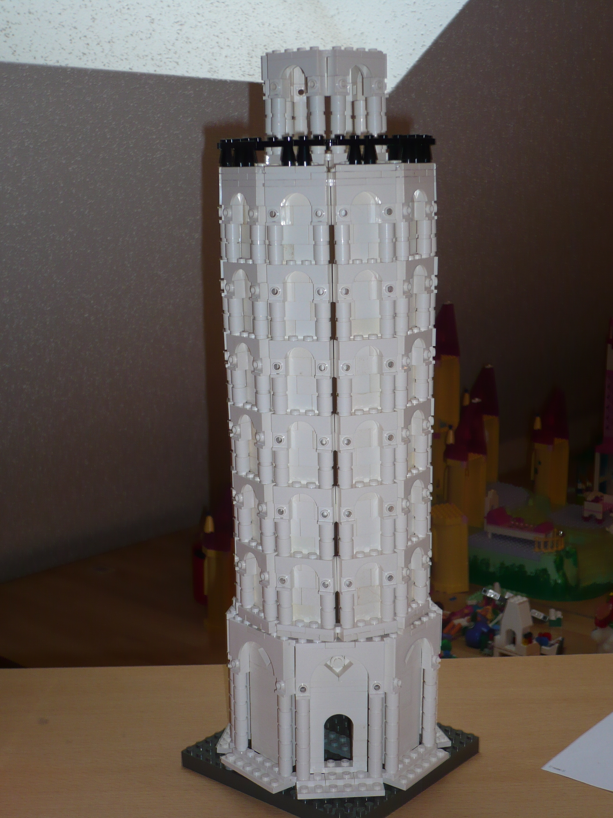
The Leaning Tower of Pisa, here depicted by Markmuel, is actually the bell tower, or campanile, of the Pisa Cathedral. The fact that the tower began to tilt soon after its construction really sealed its public image. It's in some ways too bad that the Tower gets so much attention to the extent that the Cathedral and the Baptistry, all built in the same plaza, get very little notice. I was actually there in 1991, a year after the Tower was closed to the public for a decade of restoration work, and all three structures are amazingly beautiful.

Subscribe to:
Comments (Atom)
